
kraft heinz fat rabbit
Brief: With the rise of health conscious consumers, Kraft Heinz wanted to create a ground-breaking frozen veggie meal full of not just nutrients, but attitude.
Consumer Insight: “I want to be healthy, but I don’t want to compromise on taste. Most veggie meals I’ve tried still leave me hungry".
After a brainstorm & rapid ideation session with the client, we created 2 different design directions to test with consumers.
New-to-Market Brand
Concept Development
Package Design

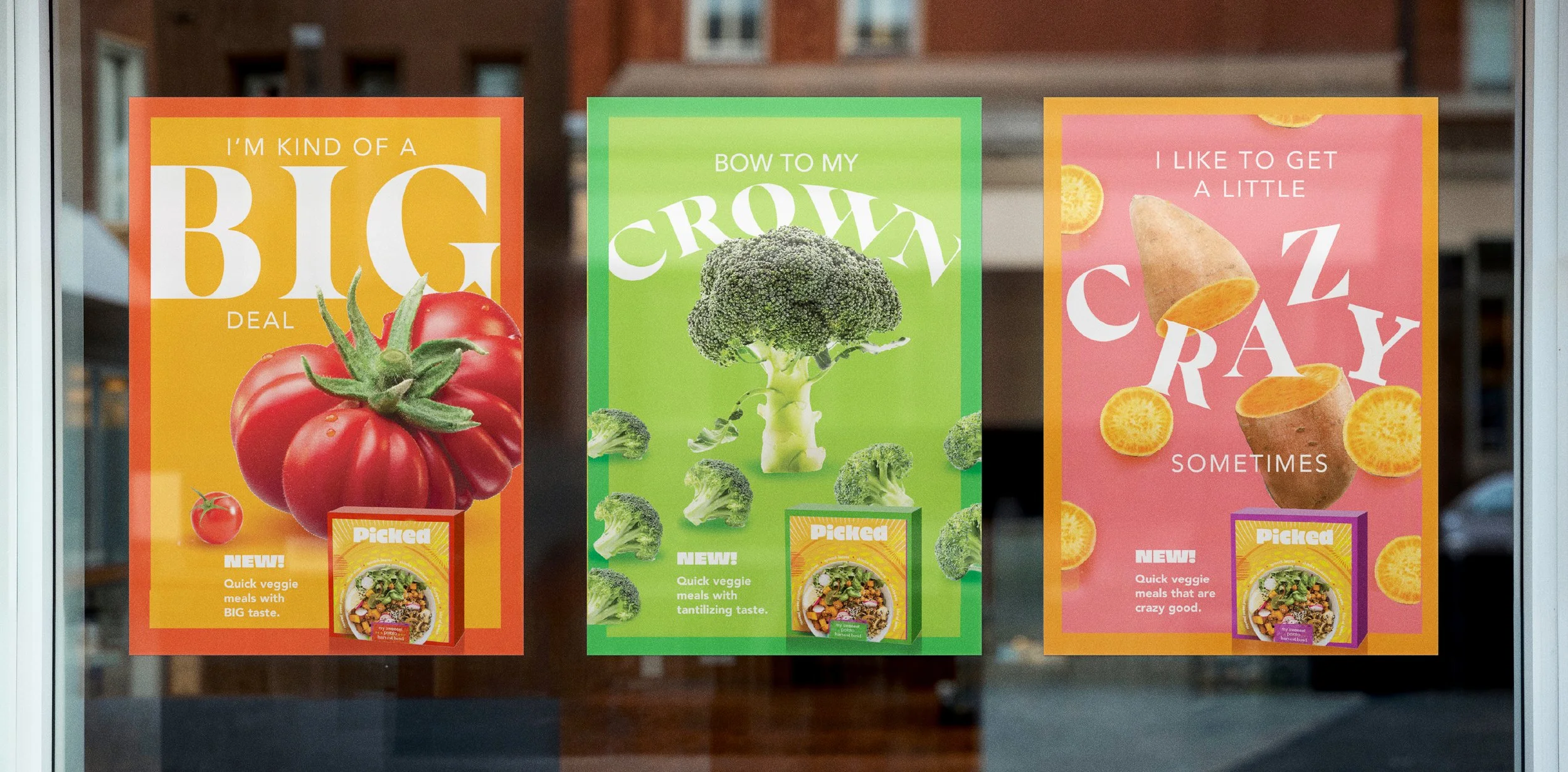
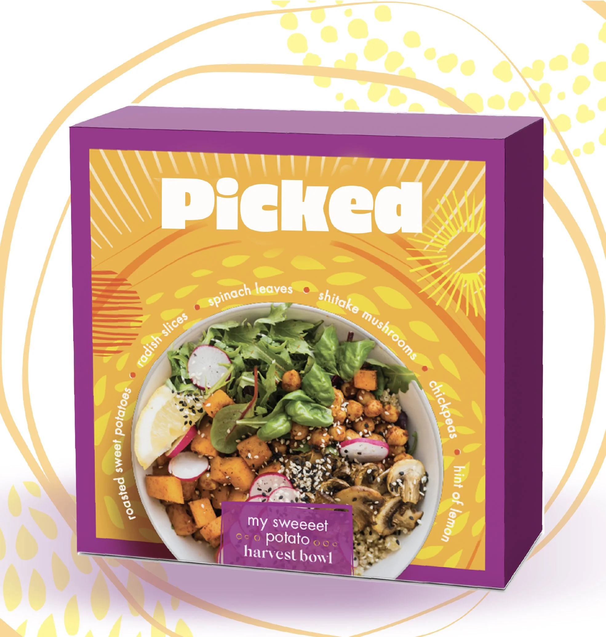
design direction 01: Eye candy
Vibrant / Playful / Curated

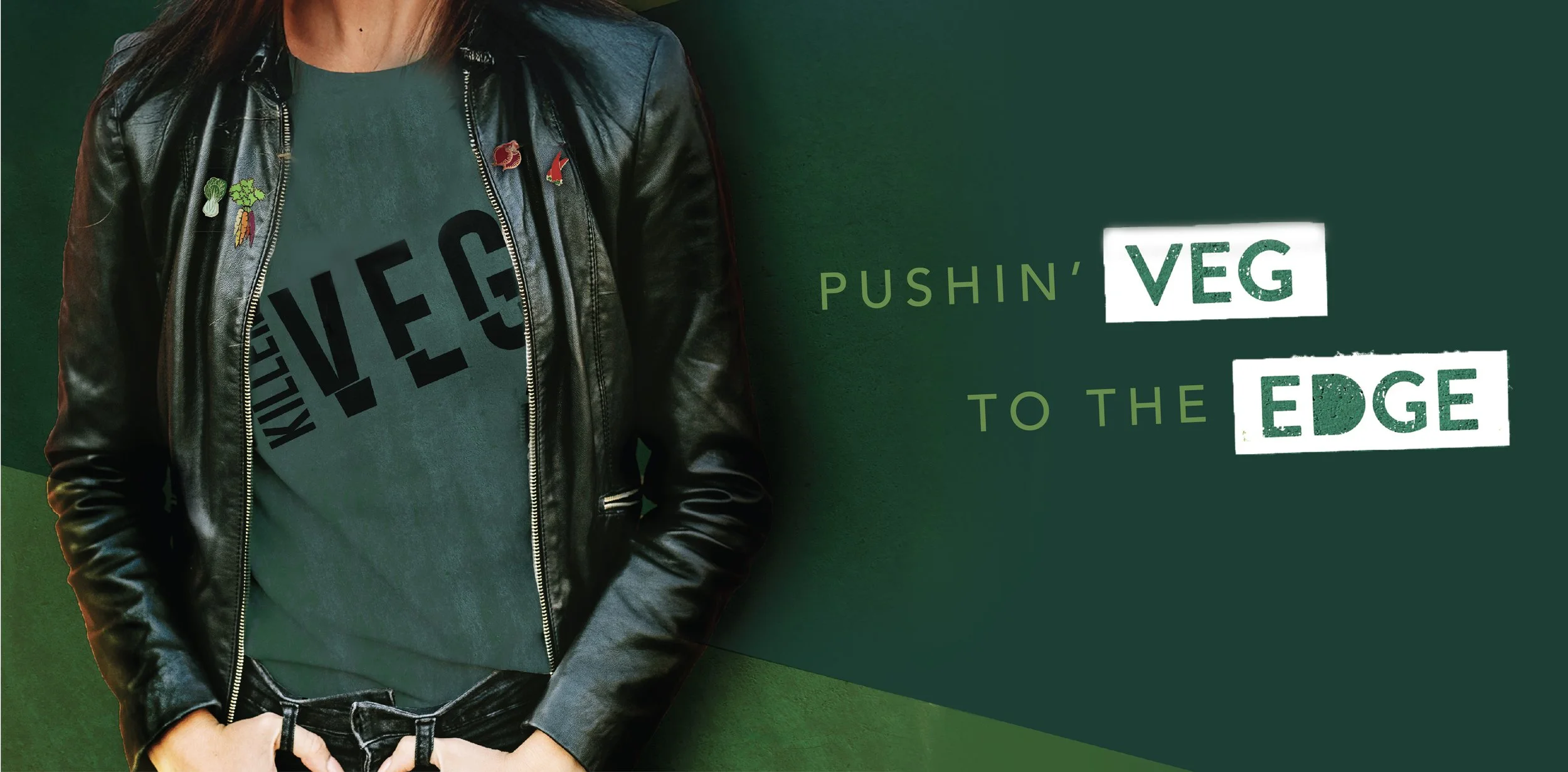
Design direction 02: Rebel roots
Bold / Strong / Edgy

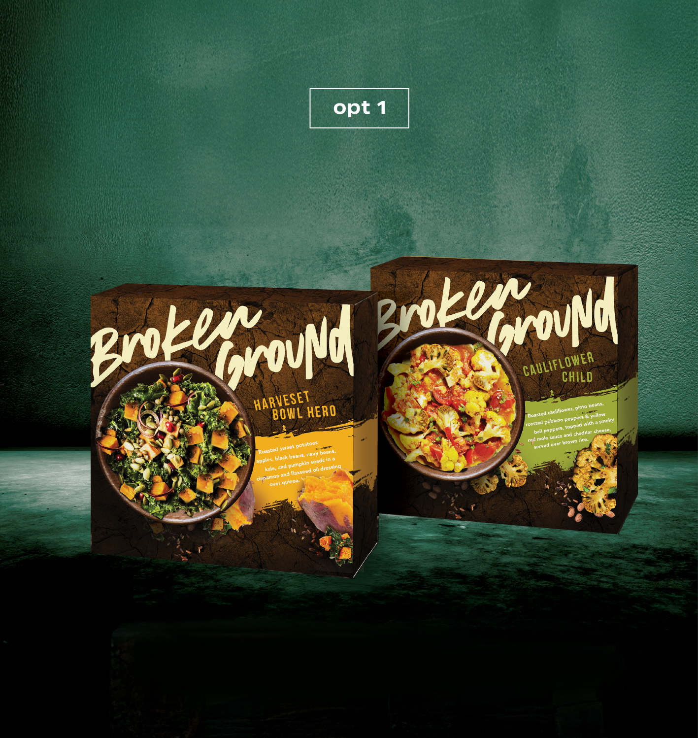
OPT 1
This design encapsulates the strength, the grit of vegetables. Their roots push through the ground, and they endure the hot sun. Veggies nourish us and keep us fueled for whatever the day brings.
OPT 2
This packaging has a special opening perforation to mimic the slashing, slicing, dicing of the vegetables,

OPT 3
Heroing the main veggie in an unexpected way is a design technique used to grab the consumers attention at shelf.

final
After consumer testing, Opt 1 tested the best. Consumers loved the natural elements and that they could see what the final tasty product looks like. They felt like this design made it look like this meal could keep them feeling hungry for longer. The team decided to push the name even further and launched with the name Fat Rabbit.